Summarizing performance numbers
How should we summarize performance numbers? In a recent benchmark run, I had some interesting speedup numbers that I wasn't certain how to report. While it's easy to make charts that are illuminating, I'm not certain what I should say in, e.g., an abstract.
Here's the raw data (also available as a spreadsheet), noting that I've made everything as abstract as I can:
In the data, I've recorded the runtime of 2 tools (tool1 and tool2) on 40 tests. The tests are lettered by theme, with a number to distinguish tests that are somehow related. Each runtime in the table is in seconds, and is the arithmetic mean of three runs exhibiting nominal variation. I run tool1 in two configurations: tool1 simply solves the problem, while tool1.min tries to solve the problem "minimally" in some sense. I run tool2 in only one configuration. In the spreadsheet, I've calculated a few summary statistics for each column. Here are the summary statistics for tool1 vs. tool2:
| Min | 1.00 |
| Arithmetic mean | 156.84 |
| Geometric mean | 12.64 |
| Harmonic mean | 4.49 |
| Median | 7.57 |
| Max | 3332.12 |
Summary statistics of tool1's speedup compared to tool2
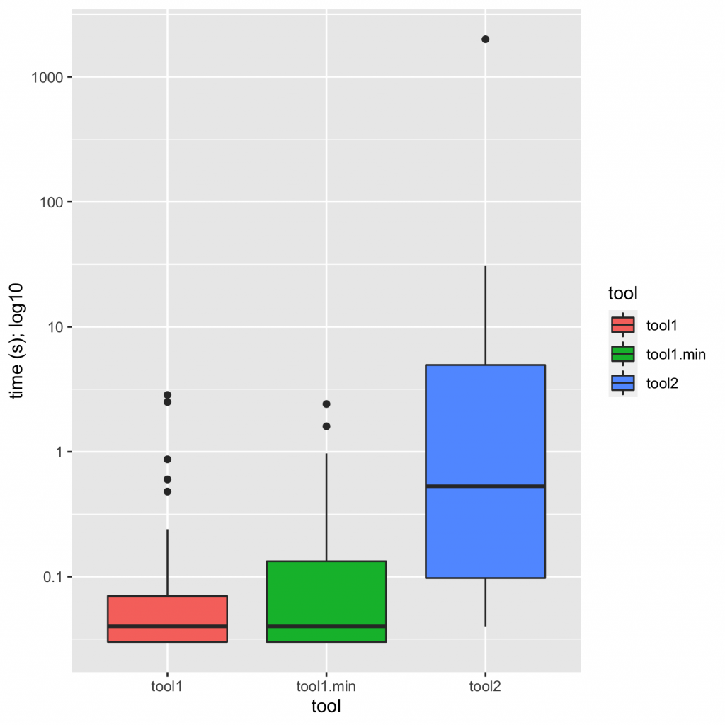
Doing some cursory analysis in R, it's easy to generate charts that give a pretty good feel for the data. (It's all in mgree/summarizing-perf on GitHub.) Here's a box plot of times:
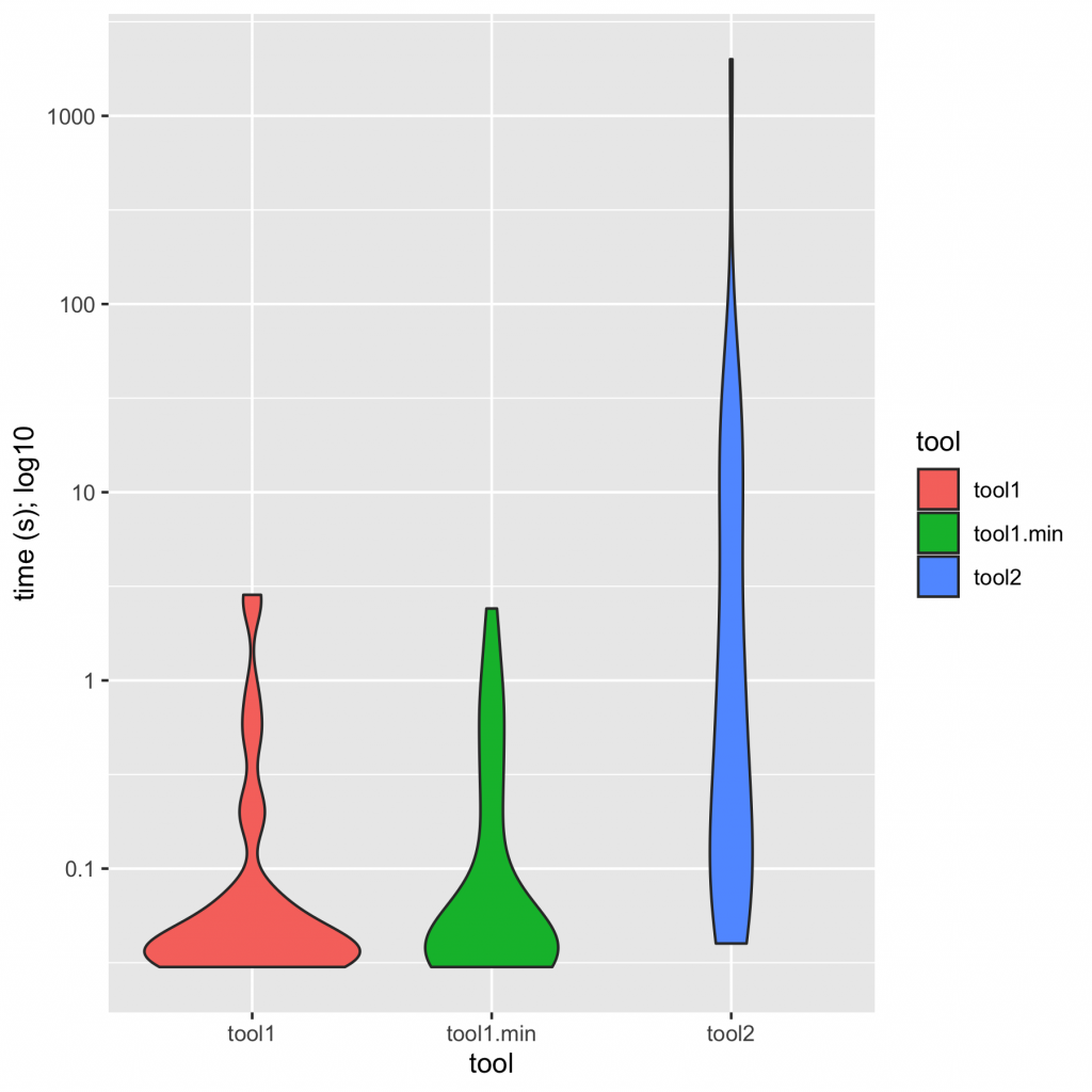
And here's a violin plot of times:
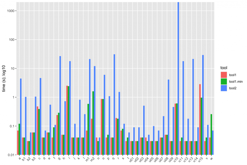
I would summarize these charts in text as, "tool1 is an order of magnitude faster than tool2; minimization closes some of the gap, but tool1.min is still substantially faster than tool2". A bar chart tells the same story:
With the bar chart, it's possible to see that sometimes tool2 is in the same league as tool1, but not usually. We have tool2 beating tool1.min only once (test w); it never beats tool1, and typically loses by 1-2 orders of magnitude. Some cases are catastrophically bad.
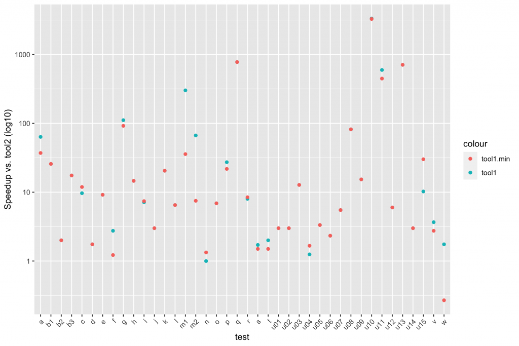
Plotting speedup lets us justify some other comments. Here's a scatter plot:
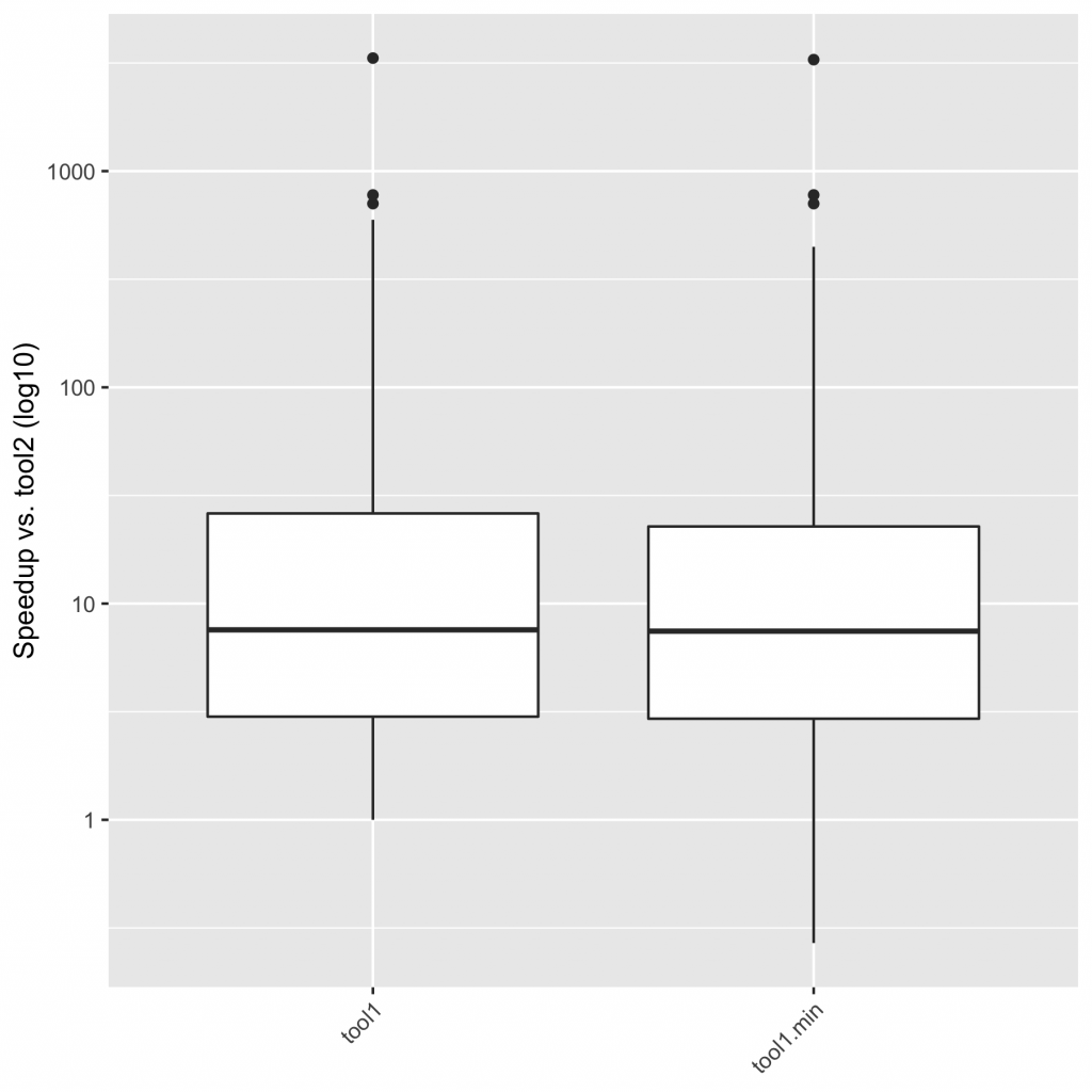
And here's a boxplot of speedups in aggregate:
Looking at these speedups, I'd feel comfortable saying that "tool1 is typically an order of magnitude faster than tool2, never slower, and sometimes much faster; tool1.min behaves similarly, though it can sometimes be slower".
This post comes out of a Twitter thread, which is a goldmine of insight and resources. Please check it out, and chime here or in the thread with your thoughts!
Special thanks to Noam Ross for help with some of the fancier log-scale stuff on the plots.
